04 PRINCIPLES OF COLOR MIXING IN INTERIOR DESIGN
Have you ever wondered why your house uses many colors but looks very confusing, other people's houses only have a few colors but are extremely eye-catching? Choosing the right color for the room, creating a sense of balance and harmony is very difficult. Fortunately, JDesign Co., LTD has color principles that you can apply very effectively. Let's learn more about this issue through our following article!
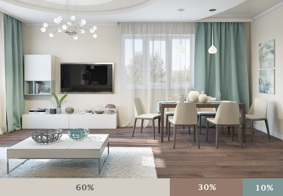
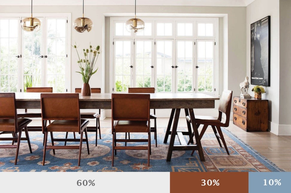
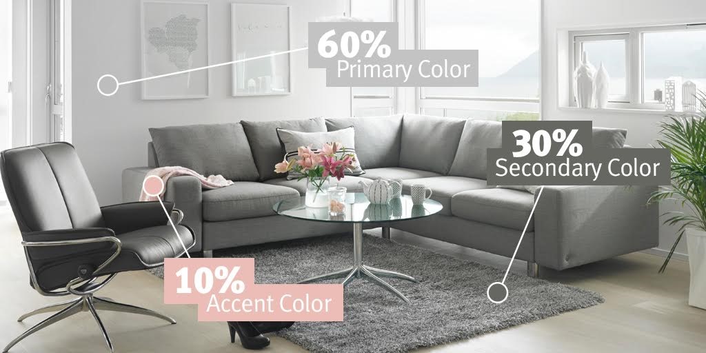
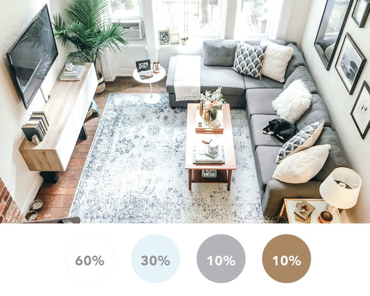
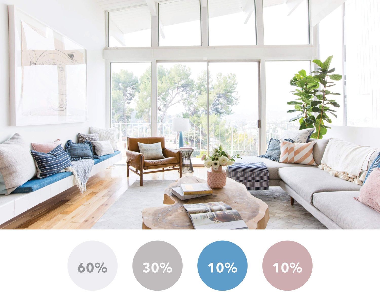
1. The 60-30-10 rule
This general design rule can be used not only for interior design but also for graphics, fashion or artwork. That's the great 60 - 30 - 10 rule based on the golden ratio.
In an interior space layout, the main color accounts for 60%, the decorative color accounts for 30%, the remaining 10% is the color used as accents.
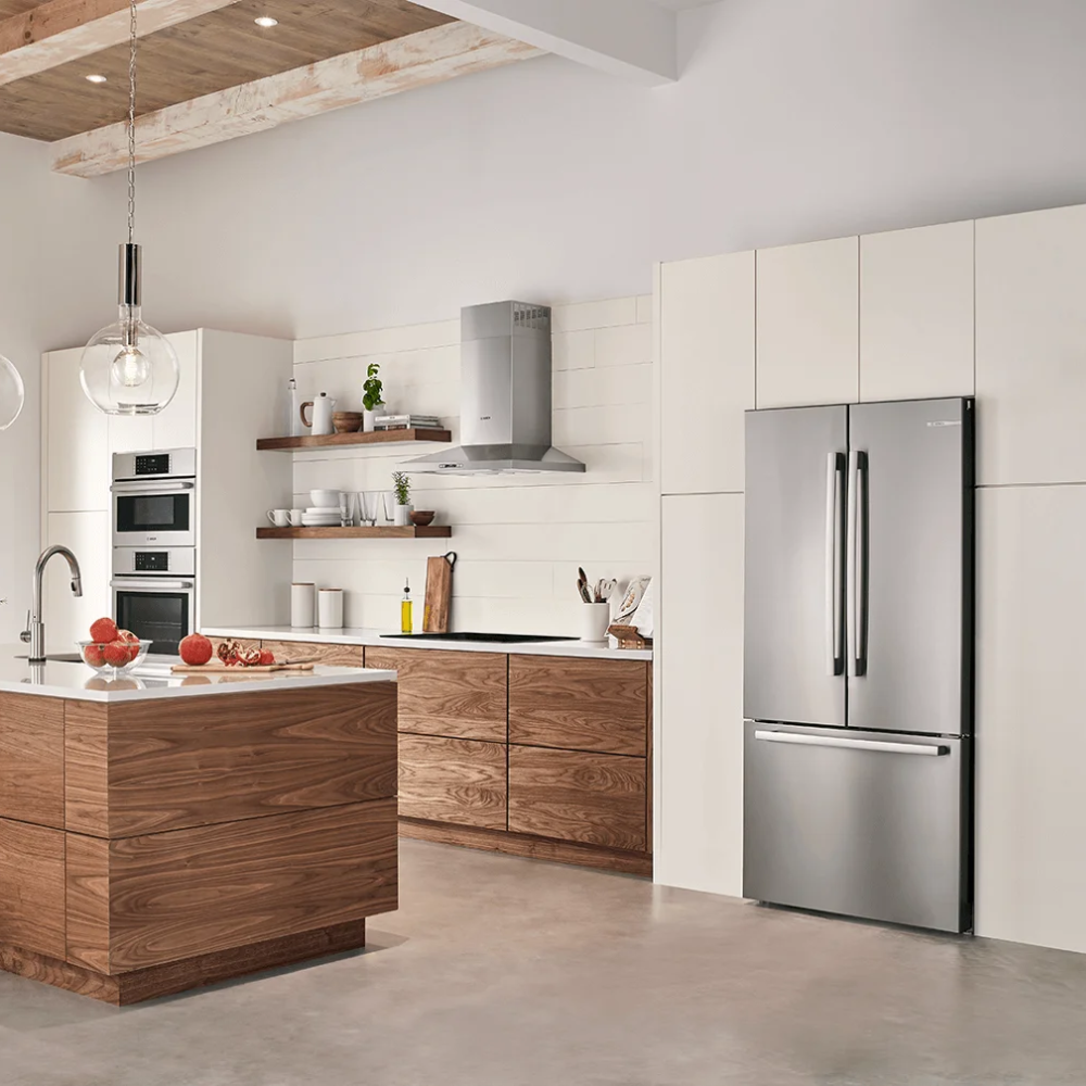
60% dominant color - Used for large areas: walls, floors or door partitions,.... The dominant color is the basis for other colors. The main colors are usually neutral colors such as white, gray or beige,...helping to create a harmonious scene. On the contrary, vibrant main tones will create a deeper first impression.
30% decorative colors - Used for interior details in the house: sofas, cabinets, tables... Decorative colors are usually other neutral colors or "fake neutral" such as green, blue or yellow, ... 30% of this color will support the main color but still be different enough to create character and interest for the space.
10% accent colors - Used for small objects in the room: lights, crafts, pillows, mattresses or decorative accessories, etc. This color group helps to create an impression and break the monotony of the space. time. With this 10%, make sure you're arranging the furniture evenly in the room but don't overdo it to get past the 10%.
When more than 3 colors are needed, you can adjust the formula relatively.
See more at: https://j-design.vn/du-an/taiwan-style-apartment-thanh-xuann.html
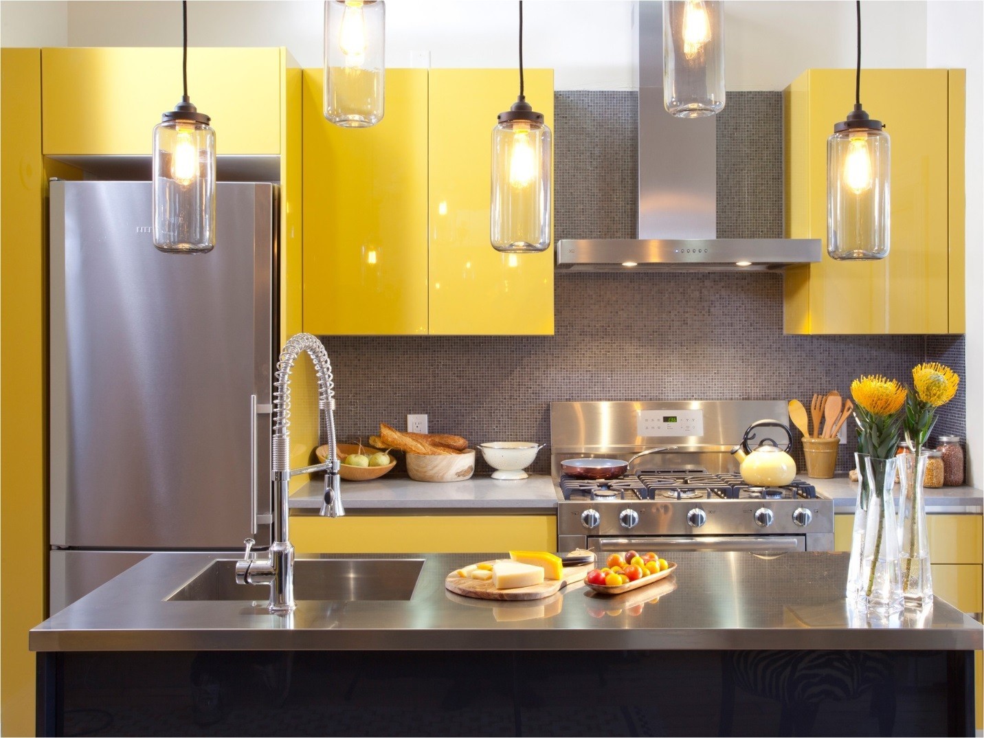
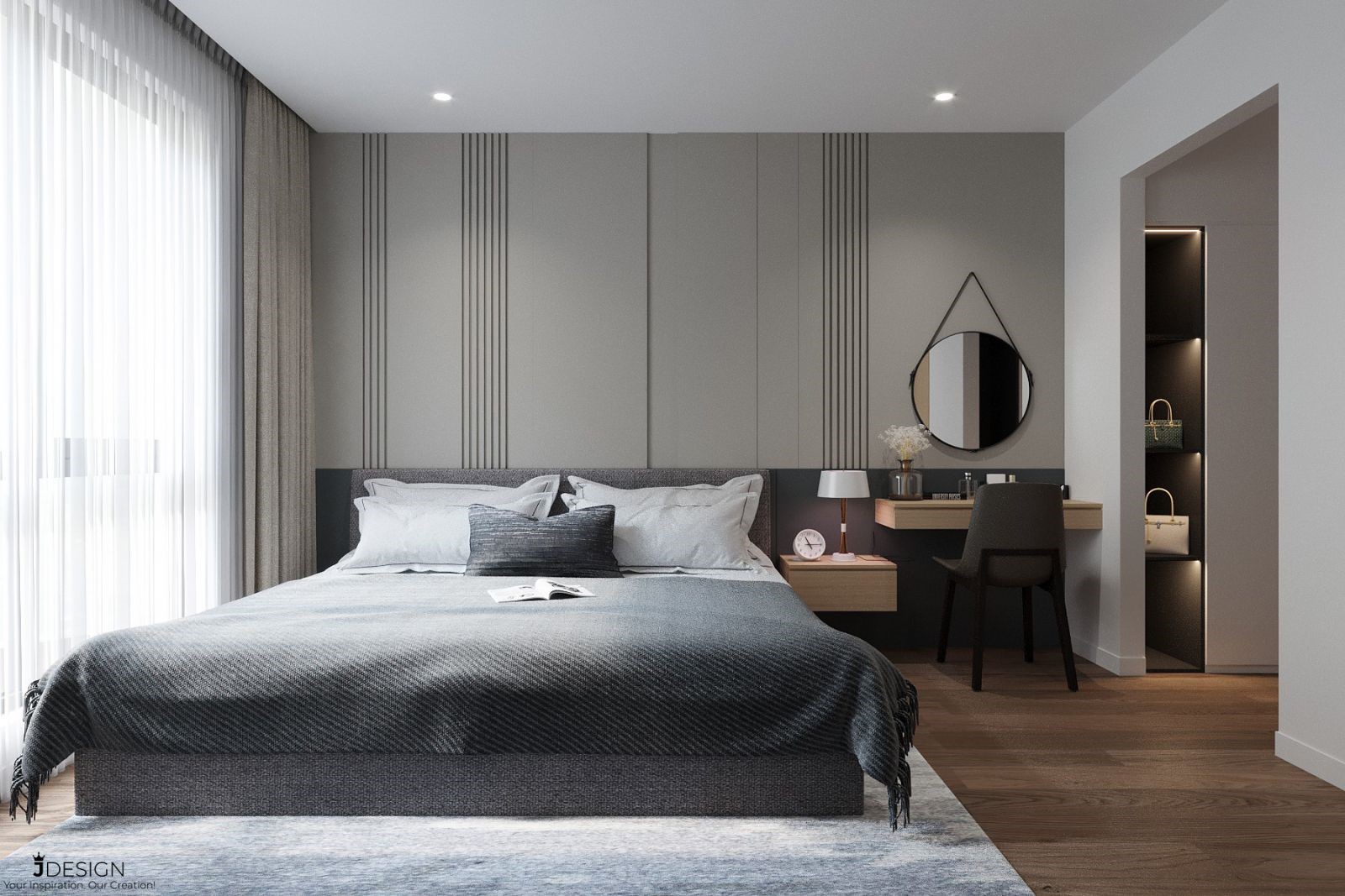
2. Combination of hot and cold colors
The warm color group and the cool color group are both represented on the color wheel. Shades like red, orange or yellow are considered warm colors because they are more vibrant. Neutral colors such as brown, bark color are also classified in this color group. Contrasting with warm colors, cool colors are cool colors such as blue, green, purple and even gray.
The choice of warm or cool colors will affect the energy of the space. Warm colors tend to bring a sense of optimism and excitement to a room, often recommended in entertainment spaces. Consider using this color group in your dining room or kitchen.
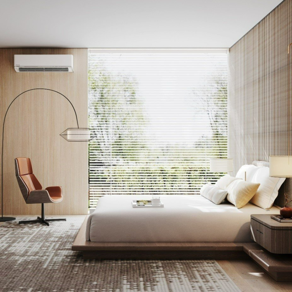
On the contrary, the cool color group has a more peaceful feeling. Cool tones are often used in bedrooms and office spaces, where a gentle, quiet energy is needed.
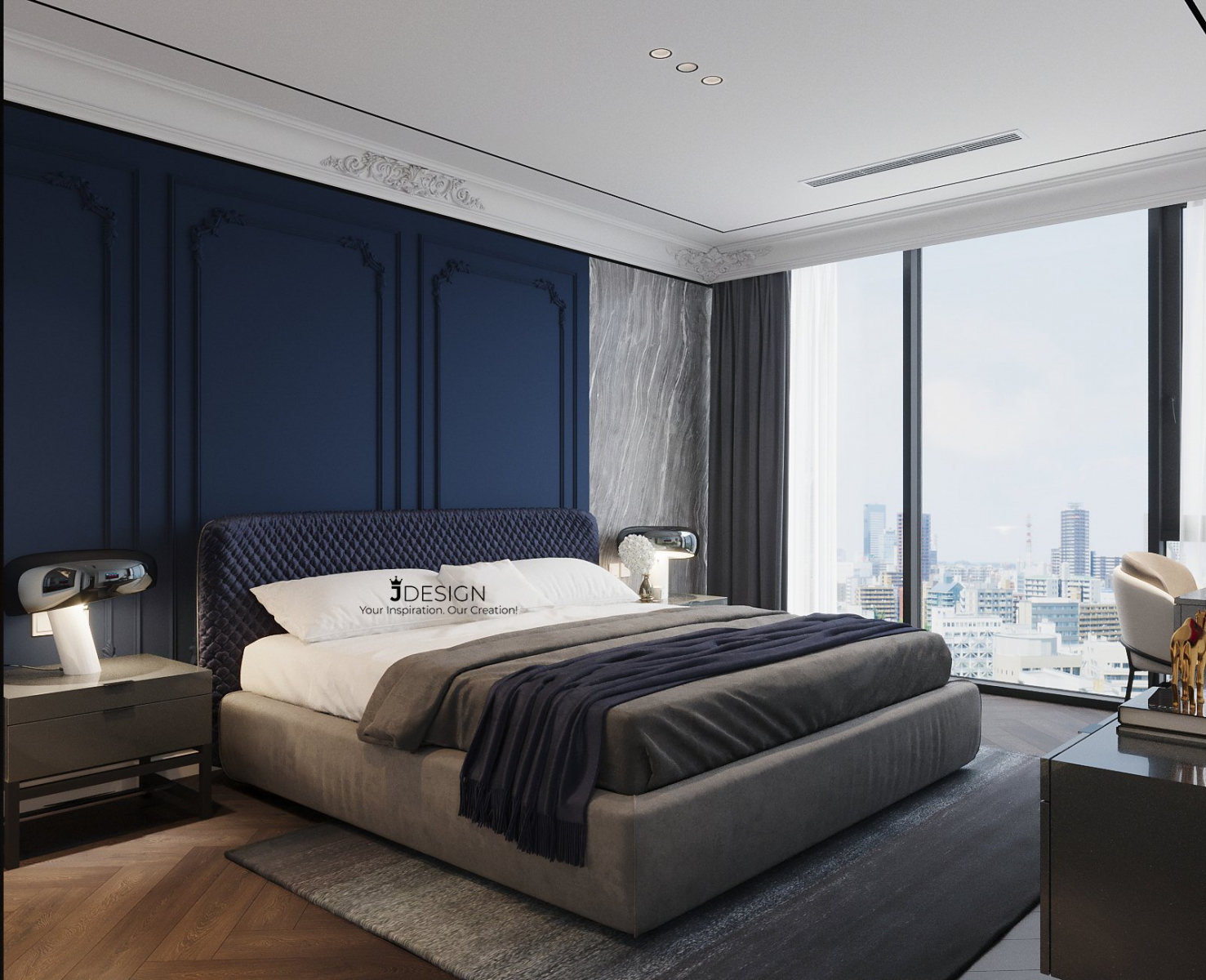
See more at: https://j-design.vn/du-an/vinhomes-metropolis-ba-dinhh.html
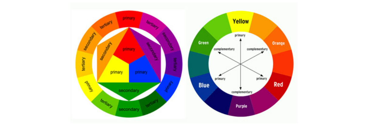
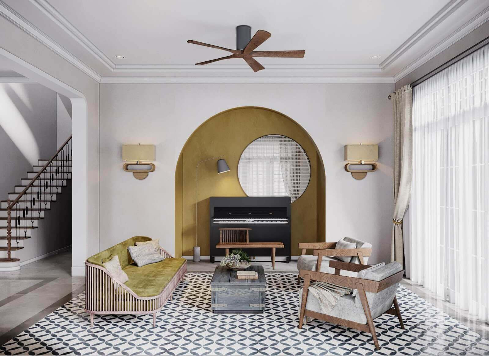
3. Complementary color schemes – Combine 2 colors that are symmetrical on the color wheel
Of the color rules interior designers use, complementary color schemes are often said to be the simplest. This rule is applied when you want to choose 2 colors for a space, then choose 2 colors that are symmetrical on the color wheel. Colors that are opposite each other on the color wheel often produce good visual effects, for example you can combine blue and orange, yellow and purple, red and green in the same space. bamboo.
As you can see in the photo below, the purple and yellow symmetrical color pair has an extremely high contrast, bringing a strong energy into the space.
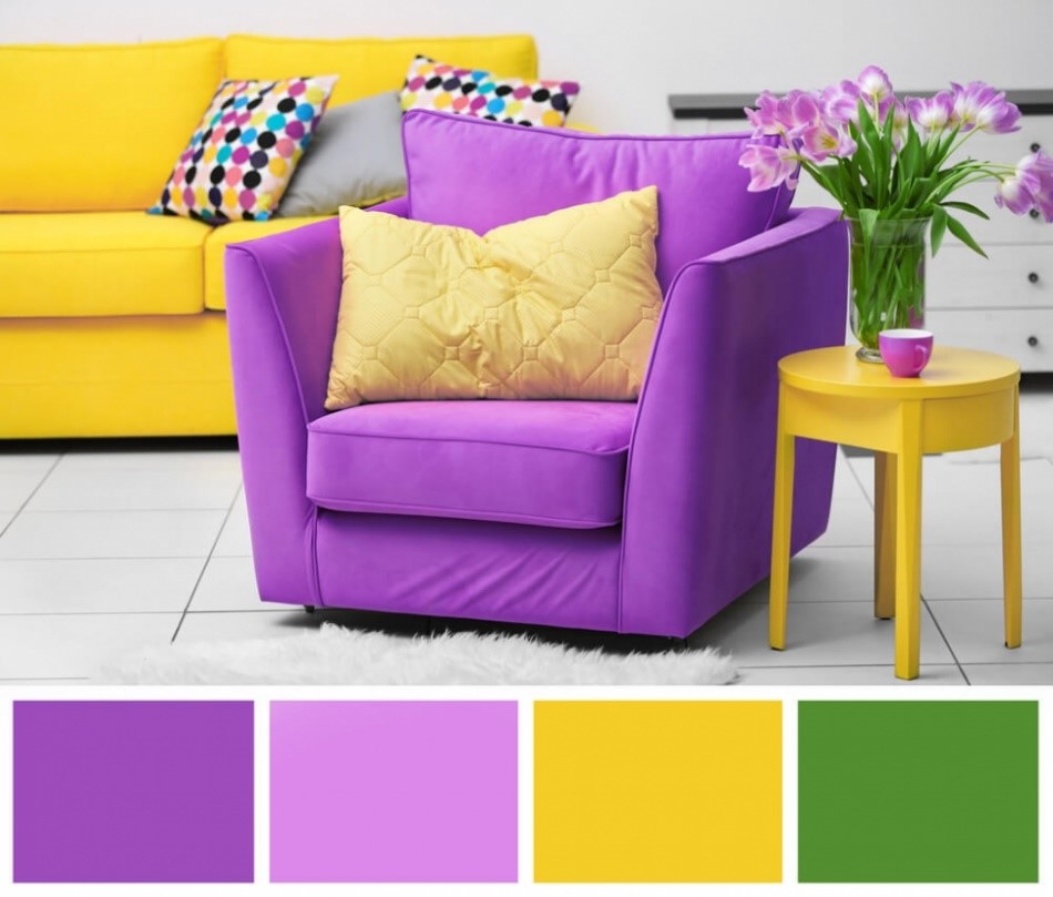
However, when combining such vibrant colors, you should only use it in small doses or just use it as an accent color. Also, balance these vibrant colors with neutrals to create harmony as well as give the visual rest.
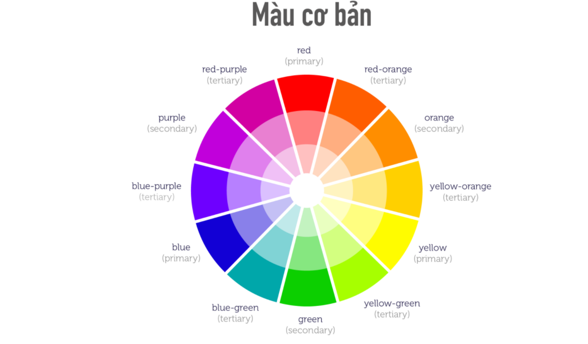
4. Analogous Color Matching - Combine colors that are next to each other on the color wheel
If you have trouble using the color wheel, a similar color scheme option might be for you. For this rule, when choosing colors for a space, you only need to choose a central color, then use 2 more colors next to it.
Of the 3 colors selected, 1 is a mixture of the other 2, for example red, orange and yellow or red, purple and blue.
When using three colors next to each other, you need to properly scale the color of the room to ensure balance and harmony. Remember the 60 - 30 - 10 rule to keep the ratios under control.
In particular, remember, you can always use different shades of the same color to create visual diversity. On the color wheel, color shades fade in order from outside to center.
See more at: https://j-design.vn/du-an/lovely-home-vinhomes-smart-cityy.html
Alternatively, if you don't like bright colors, you can completely use neutral colors (black, white, gray) - called a monochrome palette. All you need to do is mix black and white together to get the color you want. Often colors mixed from neutral colors will be suitable for modern and youthful architectural spaces.
See more at: https://j-design.vn/du-an/pure-apartment-tay-hoo.html
In interior design, there are many different color coordination principles, but the above are the four most basic principles that homeowners must know to work with architects to design the interior of apartments, apartments, individual style villas, special, personality, luxury and modern.
------------------------------------------------------
JDesign Co., LTD - PROVIDE PACKAGE SOLUTION RELATED TO INTERIOR DESIGN AND CONSTRUCTION!
Contact us now to schedule a Free Consultation/Survey/Quote!
Product warranty up to 03 years – Commitment to product maintenance for life!
For more details please contact:
- Email: contact.jdesignvn@gmail.com
- Tel: (+84) 866.648.298
- Website: https://j-design.vn/
- Fanpage: https://www.facebook.com/jdesignvn
- Corporate Office: 03/50 Nguy Nhu Kon Tum, Nhan Chinh, Thanh Xuan, Ha Noi
JDesign - Your Inspiration. Our Creation!
#jdesignvn #interior #interiordesign #interiordecor